
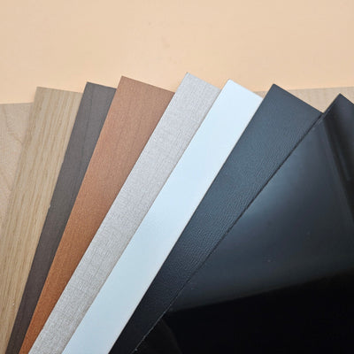


Leatherette colour and engraving contrast: which colour engraves best
Updated Jun 2026TL;DR: PU leatherette engrave contrast depends almost entirely on colour. Light colours (white, beige, light grey, pastels) engrave with a darker mark and read with high contrast. Dark colours (black, navy, dark brown) engrave with a paler mark, often light tan, that reads softer. Metallic and glitter finishes engrave differently again, sometimes revealing the substrate below. This guide tells you what to expect from each colour family before you cut.
Why colour drives the engrave look
When a laser hits PU leatherette, it does two things at once. It vaporises a few microns of the surface dye, exposing the substrate underneath. And it slightly chars the exposed substrate, darkening it.
Both effects work together to create the engrave contrast. The surface dye is what is removed. The exposed substrate (and its colour) is what shows. The slight char on top of the substrate shifts the visible tone toward a warmer brown.
So engrave contrast depends on:
- The surface colour (what is removed)
- The substrate colour beneath it (what shows)
- How much char the engrave produces (which darkens what shows)
Different colour families behave very differently across these three.

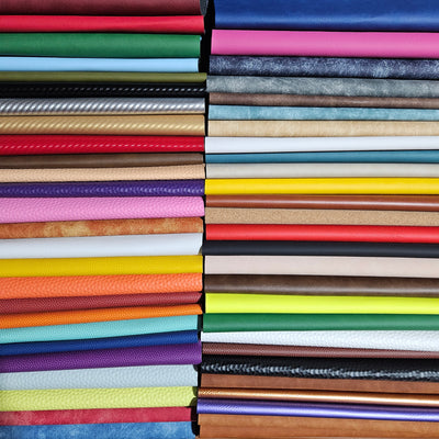
Light colours: highest contrast
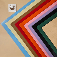
White, beige, cream, light grey, pastel pink, pastel blue, mint, butter yellow.
What happens: The light surface dye is removed cleanly. The exposed substrate (usually a darker tone underneath the dye) reads dark against the light face. Char adds a brown tint to the dark area.
Visible engrave colour: Medium brown to dark brown. High contrast.
Best for: Fine text, photo engraves, intricate logos, anything where readability at small size matters.
Watch for: Char smear on the face from inadequate air assist. Light colours show fingerprints and smudges more.
Dark colours: low contrast, warm tone
Black, navy, dark brown, charcoal, oxblood, forest green.
What happens: The dark surface dye is removed. The exposed substrate (often a warm beige or tan in dark-pigmented leatherette) reads lighter than the face. Char adds warmth but cannot overcome the colour shift.
Visible engrave colour: Light tan to medium brown against the dark face. Softer contrast.
Best for: Lifestyle pieces where the engrave is meant to feel embossed, decorative monograms, larger designs where contrast matters less.
Watch for: Power-too-high looks worse on dark colours than on light. If you push power, you start to burn the substrate, which goes black rather than tan, and the engrave looks angry.
Saturated mid-tones: variable
Red, burgundy, royal blue, kelly green, mustard yellow, terracotta.
What happens: Depends entirely on the substrate underneath. Some manufacturers use a beige substrate, some use white, some use a similar-tone substrate. Engrave reads anywhere from tan to near-white to nearly invisible.
Visible engrave colour: Sometimes excellent, sometimes disappointing. Cannot be predicted without testing.
Best for: Test before committing. If contrast is good, treat as a premium engrave colour. If contrast is poor, use the colour for cut-shape designs and skip the engrave.
Watch for: Same brand of "red" from two batches can engrave differently. Buy a test swatch from each shipment.
Metallic finishes: substrate reveals
Gold metallic, silver metallic, rose gold, copper, gunmetal.
What happens: Metallic finishes are usually a thin metallised layer over a coloured substrate. The laser removes the metallic, revealing the substrate (often white or beige).
Visible engrave colour: Whatever the substrate is, usually high contrast against the metallic face.
Best for: Premium-feel engraves, monograms, statement pieces. The contrast is dramatic.
Watch for: Engrave depth matters. Too shallow and the metallic film is only partially removed (mottled look). Too deep and you start charring the substrate. Find the sweet spot.
Glitter and pearlescent finishes: substrate reveals
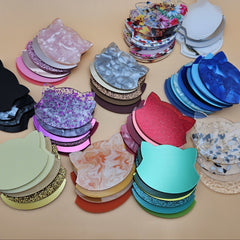
Glitter colours (red glitter, gold glitter, holographic), pearlescent / iridescent colours.
What happens: Glitter particles are embedded in a clear or pigmented binder. Engraving removes the surface layer including the glitter, exposing the substrate.
Visible engrave colour: Generally a flat tone (no glitter in the engraved area) against the sparkly face. The contrast is between sparkle and matte, not light and dark.
Best for: Statement designs where the engrave is the focal point. Works beautifully for letters and logos.
Watch for: Glitter binder can be slightly more reflective than standard PU, so laser settings need a small downward adjustment. Test on scrap before committing.
Side-by-side at-a-glance
- White, cream, pastels. Engrave reads medium to dark brown, high contrast. Best for fine text, photo engraves, logos.
- Beige, tan, light grey. Engrave reads brown, high contrast. Best for everyday production and hat patches.
- Saturated mid-tones. Engrave reads variable; test first. Best for decorative engraves after testing.
- Black, navy, dark brown. Engrave reads light tan, soft contrast. Best for embossed-feel designs and monograms.
- Metallic. Engrave exposes the substrate colour for a dramatic effect. Best for premium statement pieces.
- Glitter, pearlescent. Engrave reads matte against the sparkle (texture-based contrast). Best for focal-point engraves and letters.
- Fluorescent, neon. Engrave contrast is often poor. Best for cut-shape designs; skip the engrave.
Engrave settings by colour: the general rules
You will run different power and speed for different colour families. Some patterns:
Light colours. Engrave at low to moderate power, high speed, single pass. Goal: remove dye, slight char. Aggressive settings burn the substrate and read bad.
Dark colours. Engrave at moderate power, moderate speed, single pass. Goal: remove dye cleanly without burning. Hitting the substrate too hard gives a black-charred look that reads worse than a clean tan.
Metallic. Engrave at moderate power, moderate speed. Adjust until the metallic is fully removed but the substrate is not charred. Run a small test grid to dial this in for each new colour.
Glitter. Engrave at moderate to low power, high speed. The binder responds well to a light touch.
For specific settings recipes by colour, see our community settings database.
How to test before committing to a product line
If you are building an Etsy listing around a specific colour, test before you commit:
- Order one sheet of the colour (or buy a sample swatch if available).
- Engrave a small test grid: one corner with low power, one with medium, one with high. Same speed across.
- Engrave a second grid with the chosen power but varied speed.
- Photograph the results under natural daylight, not shop lighting. Daylight is what your customers see.
- Choose the cell that reads cleanest in the photo, not the cell that reads cleanest in person. Customer perception follows photographed contrast.
This 20 minute test catches the "this colour looks great in person but terrible in listing photos" problem before you have 50 listings to update.
Combining colours in layered pieces
Layered leatherette art uses two or more colours stacked. Plan the engrave layer carefully:
Engrave on the top layer only. The bottom layer is visible through the engrave cutouts of the top layer; you do not need to engrave it.
Light top over dark bottom. Cut a design out of light leatherette, lay over dark. The dark shows through. No engrave needed.
Dark top over light bottom. Engrave the top with a design, then the light bottom reads through the engrave like a mask reveal. This is the cleanest two-layer technique because the engrave contrast comes from the colour difference, not the engrave depth.
Three or more layers. Pick contrasting families: light, mid-tone, dark. Avoid stacking three similar tones; the design loses depth.
Frequently asked questions
Q: My black leatherette engrave came out almost invisible. What went wrong? A: Black PU with a black substrate. Some manufacturers use a similar-tone substrate to keep the colour "looking black" through the thickness. The fix is to switch suppliers or to mark the design as "embossed only" rather than engraved.
Q: Why does my white leatherette engrave have brown halos around fine letters? A: Char re-deposit from inadequate air assist. Increase air pressure during engraving. Some halo is unavoidable on white; if it bothers you, switch to beige or cream which hide it better.
Q: My customer wants the same design in 10 colours. How do I price for variable engrave time? A: Run a 5-minute test on each colour first. Engrave times vary by colour because optimum power settings vary. Build the slowest colour's time into the listing price.
Q: Does humidity affect engrave colour? A: Slightly. Humid PU stores moisture in the substrate, which produces more brown char on the engrave. Difference is small but visible side by side. Keep stock in a stable shop environment.
Q: Can I dye my own PU leatherette to a custom colour? A: Not effectively. PU has a low-energy surface and does not accept dyes the way fabric or natural leather does. Order the colour you want.
Q: Do glitter leatherettes have laser safety concerns? A: As long as the polymer is PU (not PVC) and the binder is acrylic or PU based (not PVC), no specific safety concerns beyond standard PU. Confirm the polymer and binder with the supplier.